Most of what gets built starts from something that already exists: a brief, a reference, a spec. The work here started from less than that. A feeling with no character attached to it. A face drawn by different hands across decades, never quite agreeing with itself. A sketch on paper. A technical limit with no shape yet. In every case, the real task wasn't executing a decision someone else had already made. It was making the decision: deciding what the thing actually had to be, before building it.
The clearest example of that is also the most personal one.
A Feeling, Before a Character
No brief existed beyond the one I wrote myself: a short emotional arc, a moment of quiet overthinking, then a small mental shrug, then a determined half-smile. Built like a short character study for an unannounced project, with everything that usually comes with one, casting, costume, direction, handled alone.
The character came after the feeling, not before it. Diana was built in Metahuman to carry that specific arc, in a setting isolated and slightly futuristic enough to hold a quiet emotional beat without distraction. The costume, worked out between MetaTailor and Blender, is neutral and athletic, still being refined.
Body & Camera Animation
Hand-keyed on the Metahuman body rig, following the beats laid out in the storyboard. Camera movement was animated separately, cut to a rhythm that matched the emotional arc frame by frame.
Facial Performance
The expressions were too subtle to hand-animate convincingly. The fix was performing them myself on camera, on the exact timing the storyboard called for, then transferring that performance onto Diana's face.
One Subject, Many Languages
The same subject gave shape to completely different visual languages, just by changing the rules built around it.
Fiat 500 is one of my favorite models to work with: I've used it across several studies and projects, precisely because its form is iconic enough to survive almost any stylistic treatment without losing its identity.
Toon, Dark
High-contrast shadows, the palette stripped back to near-monochrome with selective color. Noir prop style, closer to sin-city graphic novel than cartoon.
Pixel Art, VGA
12 FPS, 256-color limited palette and a fixed pixel grid, referencing the aesthetic of early 90s games running on VGA hardware.
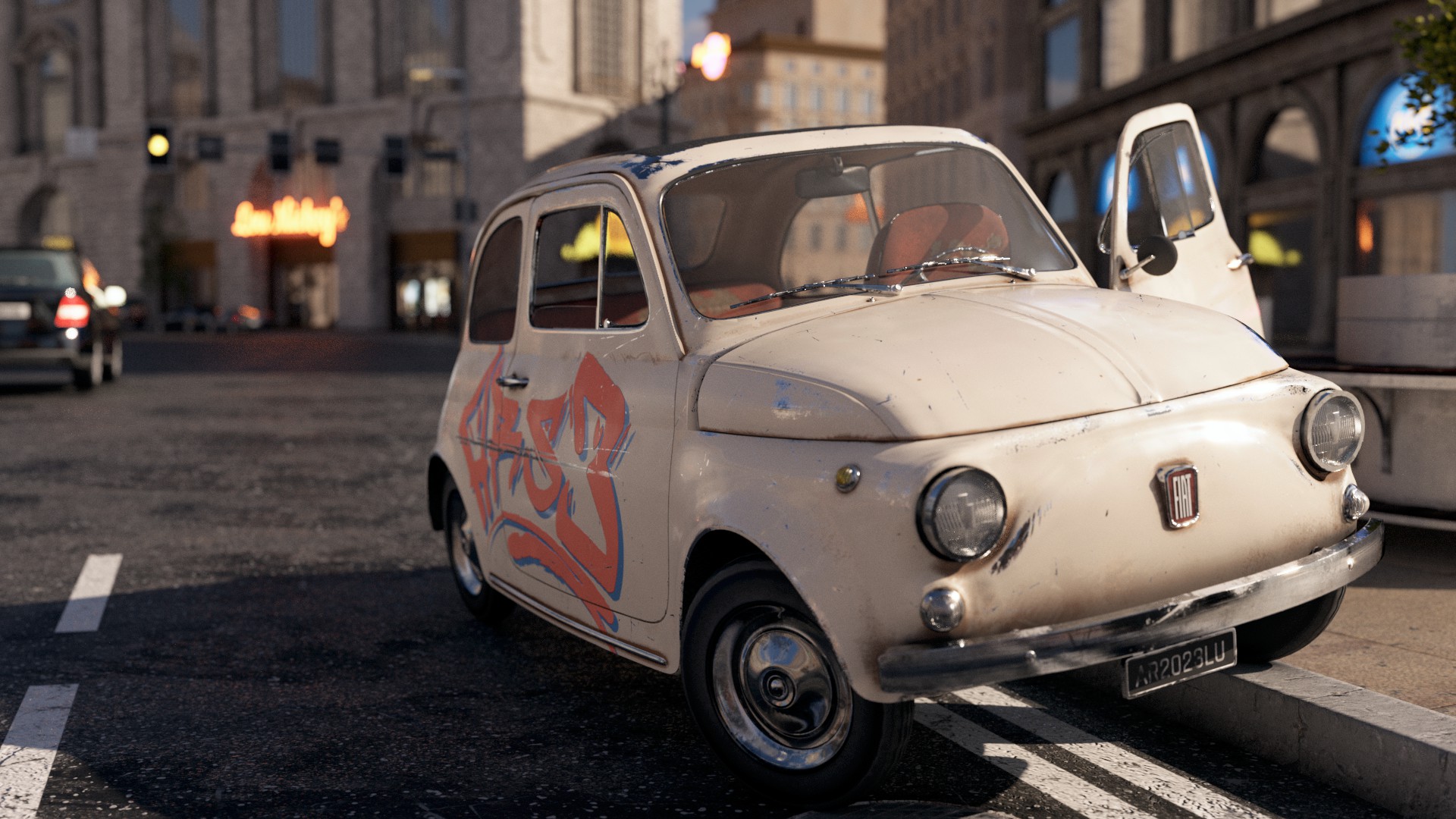
Photoreal, Damaged
The same model in V-Ray. Weathered paint, rust, and a full-side tag applied as a decal. Parked. Waiting. Clearly not for the first time.
Breakdown
A technical breakdown of the model. Wireframe and render passes in a style that references Tron: grid lines, neon outlines, dark environment.
A reference is only as useful as the decisions you're willing to make where it runs out.
Reading a Reference, or Rewriting It
Sometimes the reference is incomplete, and the work is filling the gap plausibly. Sometimes it's complete, and the work is deciding to leave it behind entirely.
Another World
Architecture inspired by an Escher painting, built into a navigable 3D space. The real work was deciding how to resolve the impossibilities so the space read as harmonious and coherent from every angle.
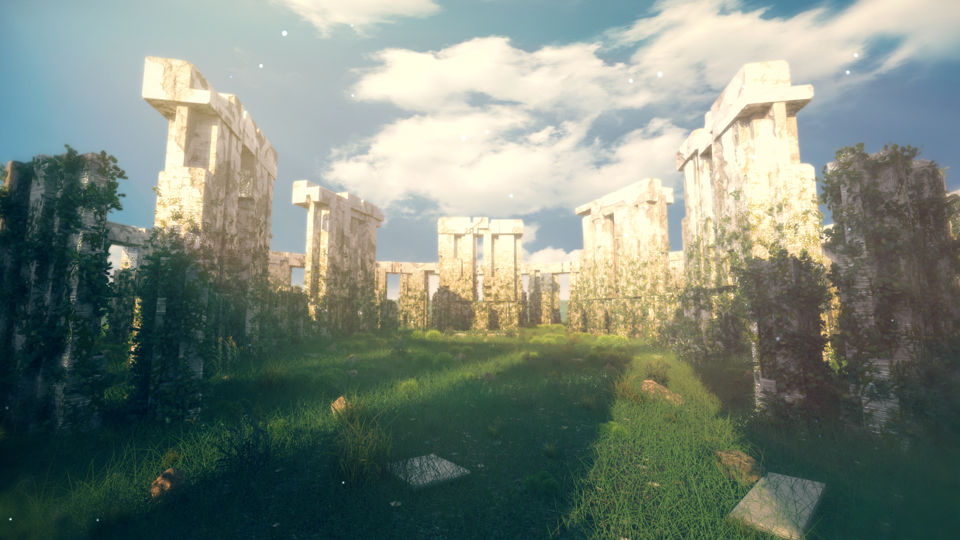
Stonehenge 2.0
A reference as fixed as it gets, rebuilt from scratch anyway. Procedurally modeled in 3ds Max, scattered with foliage, rendered in V-Ray. Same stones, different language: somewhere between brutalist and fantasy.
From Sketch to Rig
A brand mascot for an advertising campaign started as a sketch on paper, nothing more concrete than that. Translating it into 3D meant deciding on volume, proportion, and posture the sketch only implied, then building a full body and facial rig able to carry whatever direction the campaign needed.
Animated Pose
A finished animation test: body and facial rig moving together, carrying the character's personality into a single held pose before the campaign brief existed.
Breakdown
The rig exposed: bones, weights, and control structure. Every decision made explicit — how much range, where the deformation lives, what a director would actually be able to adjust on set.
Designing Inside a Constraint
The same discipline holds at very different scales: dressing an entire space, or shaping a single object someone picks up.
Potion's Store
A potion store's environment prop, pushed into exaggerated toon proportions straight from a concept artist's illustration. The concept set the visual language; the model still had to hold up low poly and game-ready, not just inside the concept frame.
Stratocaster
A Fender Stratocaster reimagined as a worn stage prop: toon, but more restrained than the environment work. Most of the character lives in the texture pass and the LOD chain, not in the silhouette itself, storytelling carried by wear and material, never spelled out.
A Few Considerations
The reference was always partial, sometimes by circumstance, sometimes by choice. What made each of these work wasn't filling that gap with more research. It was deciding confidently enough that the gap stopped being visible in the result.