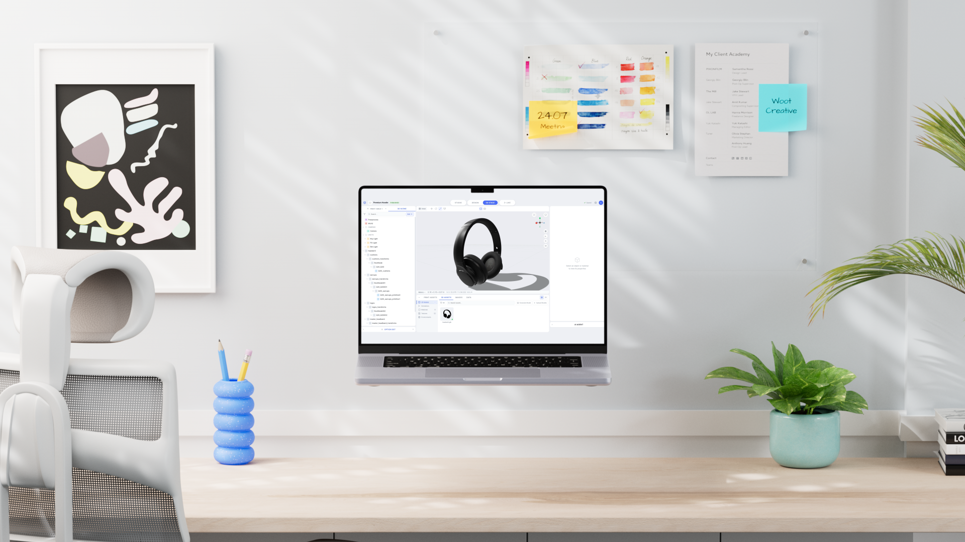
On a platform I've worked on extensively, people could personalize a product on a flat canvas, or configure it in 3D. Never both at once. One side was built for artwork, pricing, production limits. The other for variants, materials, real-time behavior. The real opportunity wasn't fixing either side. It was asking if they could become one system.
This prototype chased that question outside the limits of the live platform, built through AI-assisted development with Claude Code, which made it possible to dig deeper into interaction logic than a static design tool ever would. The direction came from a structured analysis grounded in real operational context:
- Flow analysis: tracing user paths through the platform.
- User feedback: ~350 tickets reviewed, plus direct input on what felt broken or repetitive.
- Observation: watching the platform in use, unfiltered.
- Product insight: empathy for the people using it daily, enough to tell surface issues from structural gaps.
The Friction
Three patterns emerged consistently across all methods. Each pointed to a different dimension of the same underlying problem.
The platform could not do it all
UV mapping, 2D canvas, and shaders all required leaving the platform: a structural gap.
No map through the process
Attributes, canvas layers, 3D stage: many disconnected contexts users had to map in their heads.
Errors visible only at the end
Lighting, camera setup, and configuration logic were only verifiable in the final preview.
Running across all three was a deeper tension: a Canvas is not just an editable surface, it can also be mapped onto a 3D object. Personalization, visualization, and production intent needed to stay aligned inside the same logic, but the platform kept them separate.
A prototype should not answer questions. It should make better questions possible.
Three Roles, Two Layers
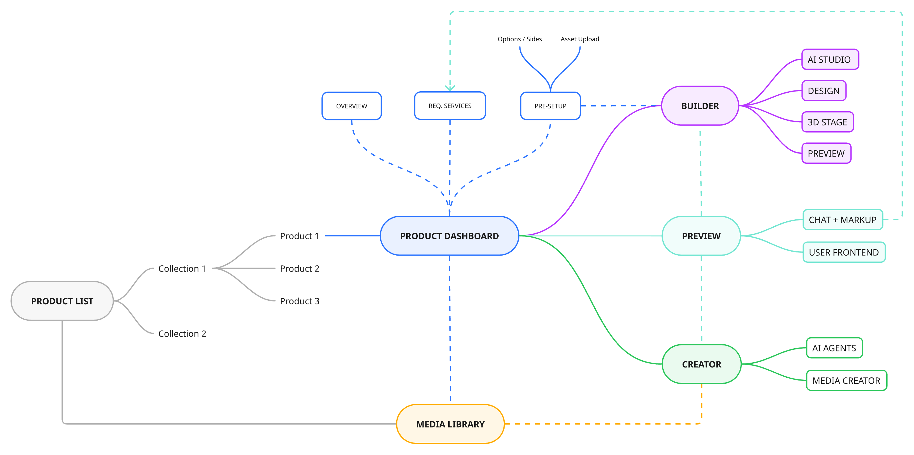
Three roles kept surfacing: graphic designers placing and editing artwork, 3D tech artists handling material mappings and real-time behavior, and PMs or merchants managing pricing and option structure without needing production depth.
They were not using the product at the same depth, so asking them to operate inside one flat interface created unnecessary friction. This led to a two-level structure.
Dashboard
A simpler environment for merchants and project owners to prepare project settings and shape the project before deeper production work begins. Its role was to absorb higher-level decisions that do not require technical depth.
Builder
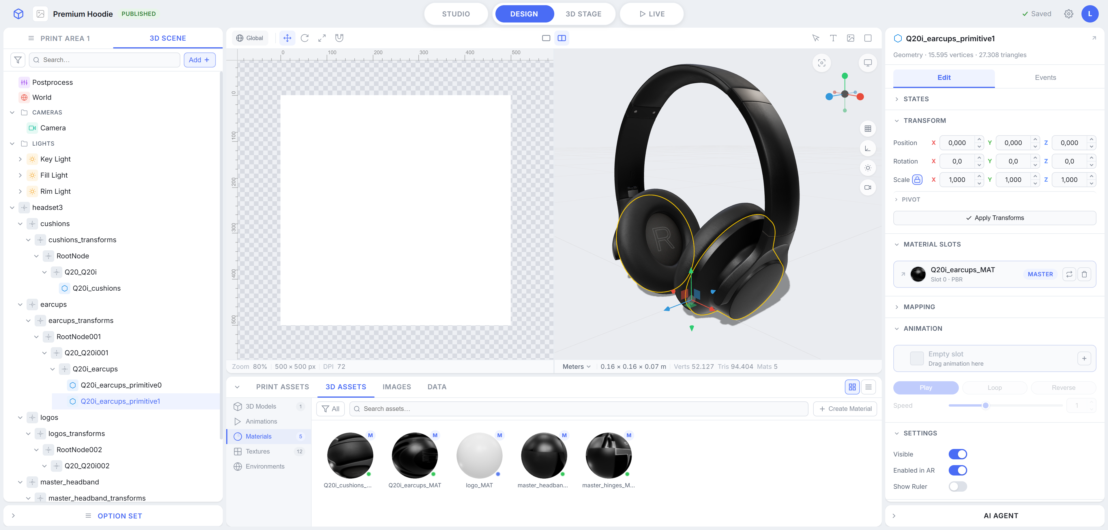
The operational environment for designers and 3D technical profiles, where assets, Canvas mappings, scene logic, frontend options, and behaviors could be authored in detail.
Design System
A large switcher at the top of the interface defines the working context of the platform. It allows users to move between Design and 3D Stage, with additional switches for Studio and Live. This makes the product legible as a multi-context architecture rather than a single editor forced to contain everything at once.
From there, the builder is organized around a few persistent interface areas. The system relies on a few patterns reused consistently across contexts, most visible in the outliner, which changes shape but never changes logic between 2D, 3D, and option views.
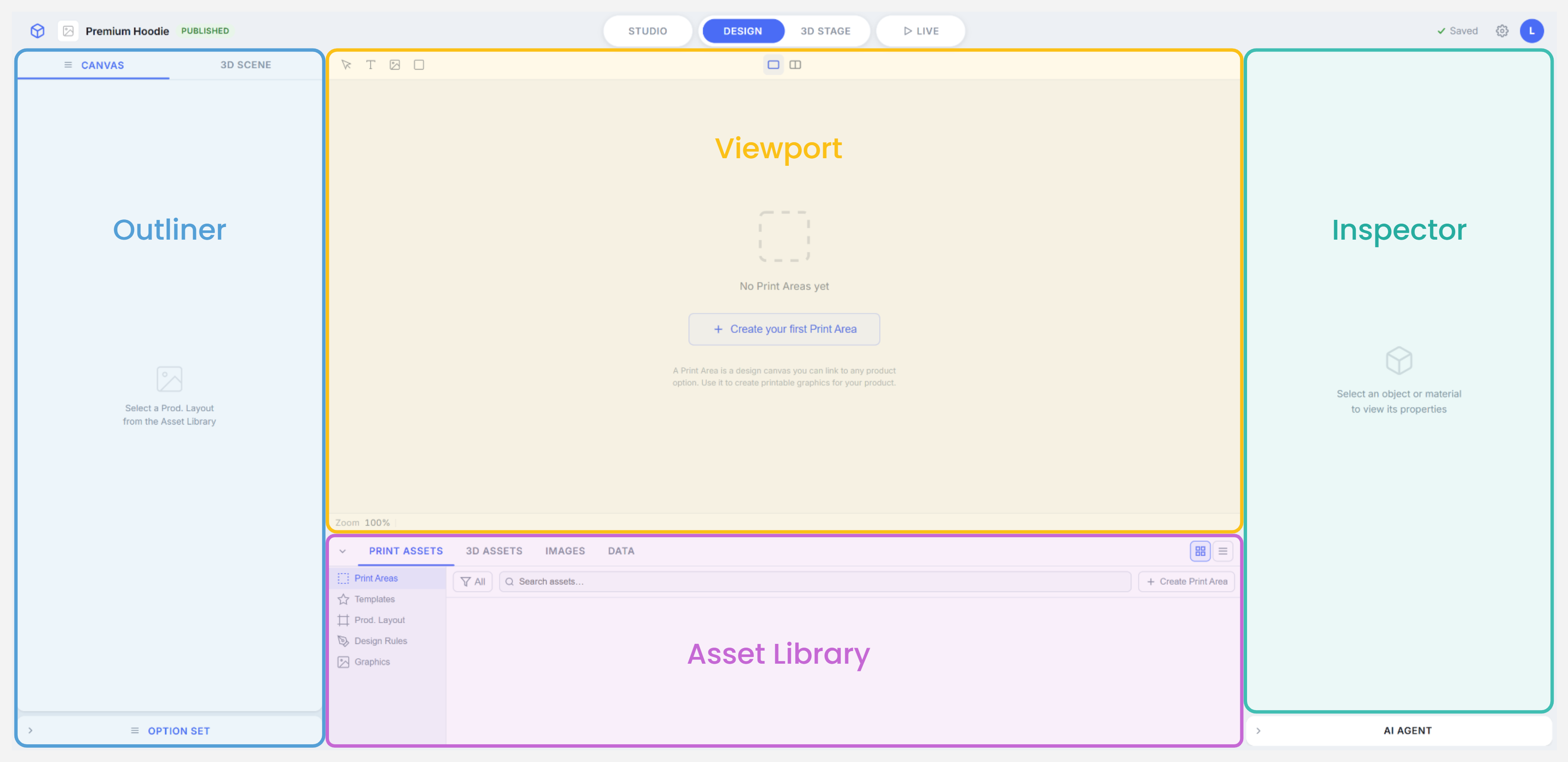
The outliner exists in different forms depending on context: a 2D outliner for Canvas and design layers, a 3D outliner for scene hierarchy, and an option set outliner dedicated to the controls that later become frontend UI elements.
Each maintains the same interaction model while exposing context-relevant structure. Switching between them is frictionless because the underlying pattern stays consistent.
The viewport supports 2D, 3D, and split modes, allowing users to work on surfaces, objects, and their relationships without leaving the same environment.
The split mode is particularly useful for maintaining alignment between Canvas layout and 3D placement during configuration. Two views, one authoring context.
The inspector is contextual. It changes according to what is selected, so complexity is revealed progressively rather than all at once.
This prevents overload while still making every available parameter accessible when needed. The same component behaves differently depending on whether a 2D element, a 3D object, or a configuration option is active.
The asset library acts as a centralized repository for all elements in the system. It is not just storage, but a control point from which assets can be reviewed, traced, replaced, and kept consistent across the project.
Any reference, whether a material, an animation, or a Canvas layer, could be opened as a slot: traced to the library, replaced from a dropdown, or updated by drag and drop. The same gesture worked everywhere it applied, so replacements and updates propagated without manual re-linking.
Configuration Logic
A key part of the exploration was clarifying how configuration should be authored. Both options and 3D objects were structured around a double level inside the inspector.
That distinction was important because it separated static definition from reactive behavior, making the authoring model clearer and more scalable.
Edit
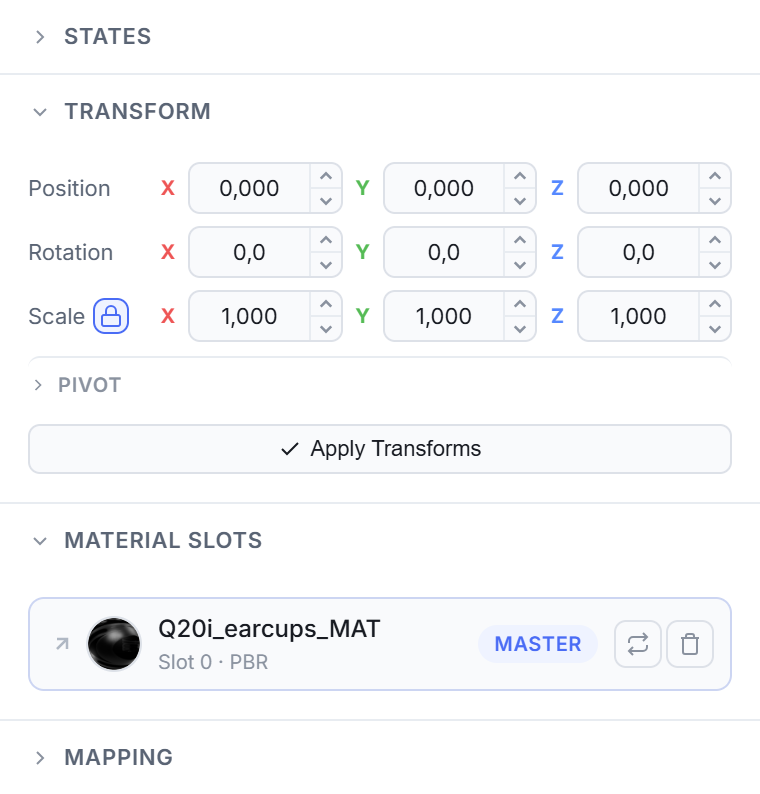
What an item is, and how it's set up: transformations, pricing logic, the Canvas sides it's tied to.
Events
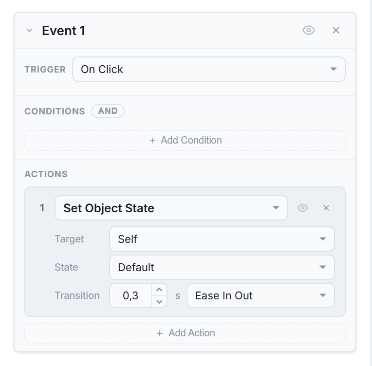
What an item does: hiding a component, updating a price, triggering a Canvas change, all through the same trigger, condition, action model, never hardcoded rules.
Two AI Layers
The exploration also introduced two distinct AI layers. Together, they framed AI as both an operational and a creative layer inside the product, each with a distinct scope and a distinct place in the interface.
AI Assistant
Designed to operate across the platform, it contextualizes assistance relative to what the user is currently doing.
AI Studio
A dedicated context for creating and editing 2D and 3D assets through a node-based AI system.
Why It Mattered
The prototype did exactly what this kind of work should do: it turned a vague sense of friction into specific, actionable decisions.
Clearer Product Vision
Distance from the as-is platform made structural friction visible: where contexts needed separation, where configuration logic needed coherence, where the product could become more consistent.
Shared Language
Scattered observations became a shared vocabulary for talking about roles, contexts, authoring logic, and AI integration as parts of a system rather than isolated features.
Individual Features, Prioritized
Rather than landing as a single monolithic pitch, the exploration broke down into individual features, each specific enough to be picked up, discussed, and prioritized on its own within the actual product roadmap.
That's the real value of building past the point a static design tool allows: the platform's friction could be named precisely enough to act on. What came out of it wasn't a concept to file away, but a set of concrete features now being carried forward directly with product and engineering.